dConstruct 2009 (Clearleft)
/20
I worked on the HTML and CSS for Clearleft’s dConstruct 2009 website, using microformats to mark up the schedules and locations.
The navigation was a bit of a challenge. The selected state was quite fiddly to develop because I wanted the text to resize without dropping out of the green strip. Here’s what I did…
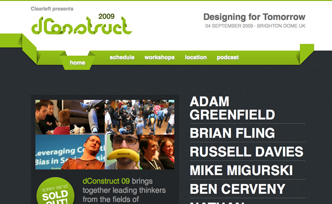

I extended the white background at the top of the image so that it would cover the green strip when the text is resized and not look too out of place. The selected state is actually two images.

While I was working on the site, Nat showed me a really good way to make the site more maintainable and use less code. The site is made up of strips of content; the header, main content, sponsors and footer, and these all have very similar properties (things like they all have a width of 80% and the same amount of margins). Rather than repeating the CSS for each class, we added a class within each strip called “section”. So if we needed to make a change to the layout and instead make the width 70%, we would only need to change this in one place.