Lemongrass - Thai Takeaway Design
/3
Had a nice surprise this week. A friend who had asked me to look/play about with a menu she’d made for her dad’s Thai takeaway contacted me to say the logo I’d done for it was being used as their shop sign! I’ve designed so much stuff that’s only seen on computers that when it does get made into something that’s bigger than me… very cool!
The design process for the menu was very informal. I chatted with my client on MSN, sending designs every few minutes, and adjusting them to her specifications. This made communication a lot easier because the design was being made in real time.
Initially, she sent me a Publisher document with the content, and an intricate pattern which she had drawn down the side. She explained that she wanted this strip to be visible when the menu is closed.
This is one of the first designs I came up with. The font I chose of the name of the takeaway is more stylised to give it a fresh and personal appearance. The ‘dishes’ heading text uses the same font, but in black to give it a professional look. I replicated the drawing to be set behind the titles and in gold to make it look like a more high quality take-away.

Then I thought I’d play about with the colours a bit. The pink was inspired by a very unusual and striking Japanese restaurant near where I live which has a hot-pink and purple colour scheme. My client preferred the green and gold design because of the connotations with lemongrass, so I continued with this design.
In the design below, I brightened the colours to make them look more fresh and appealing. I also tried a swirly image behind the name of the takeaway.
The next design looks very similar to the one before it, but the swirly pattern behind the takeaway name is slightly different.
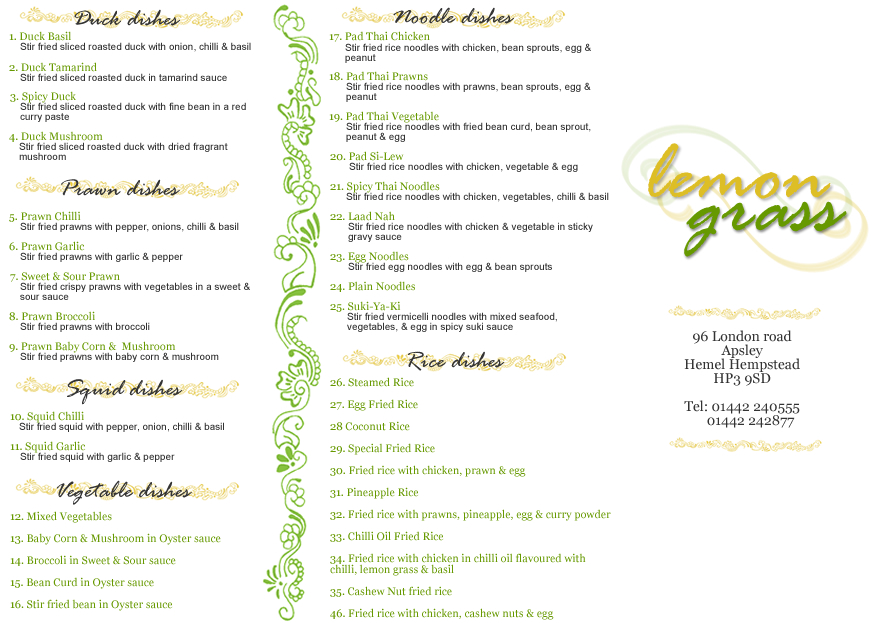
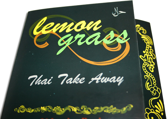
One of the things I wish I’d asked sooner was what sort of paper the menus would be printed on. I assumed it would be on standard white paper. At this point, my client said they would be printed on a glossy paper, which changed the way I thought about how it should look. On standard matte paper, small printed text doesn’t work well if the background is darker than the font colour, but on glossy paper, the text is much sharper and easier to read. So I tried a black background, and changed the ‘dishes’ headings to gold.
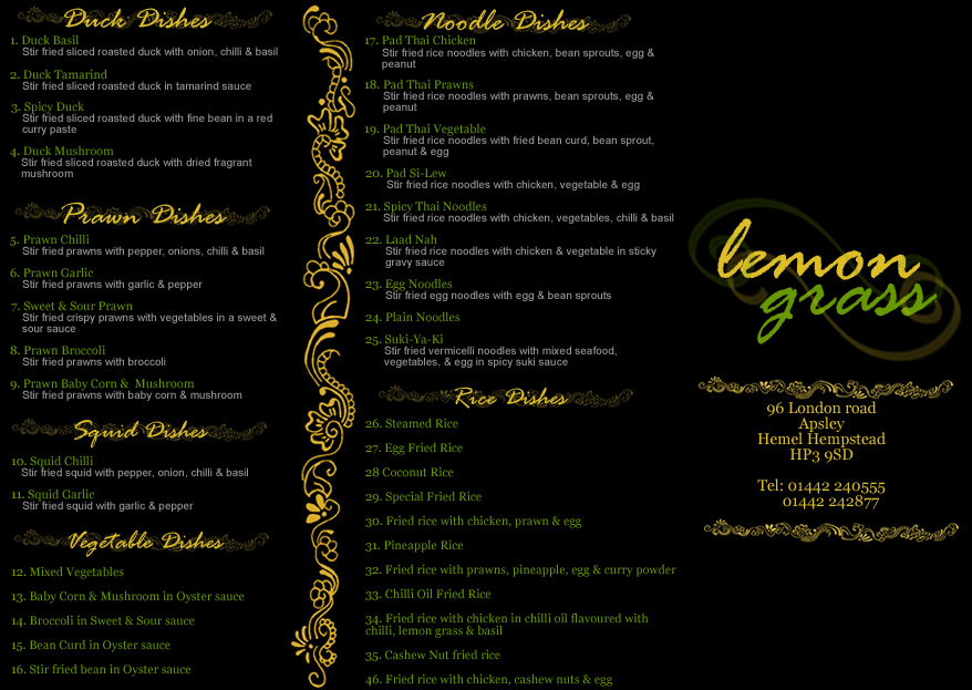
My client really liked this design, and used it as a template for the real thing.
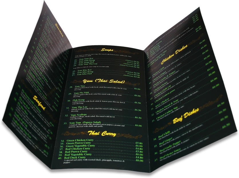
On Tuesday, she gave me the printed menu. Below are a couple of photos of it. A few elements have changed as more content was added.