Style Guide Roundup
/66
Last year, I started bookmarking front-end style guides for an article I was writing for 24 ways. When the article was published, I got loads of great recommendations of others to include in the list. So I just wanted to write a little bit about some of the ones I didn't talk about in the article, and the things that I like about them.
Starbucks's Style Guide
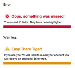
Today, Jeremy forwarded me an email from Lincoln Mongillo which linked to a style guide he'd been using to standardise Starbucks's web design. I was blown away by the level of detail this style guide contains.
Each component is split onto its own page showing how it looks in different layouts, and some components have the corresponding code.
I like the debug.css page which lists common issues and how to resolve them. Each point not only explains how to fix it, but why it works that way.
They've also produced a document listing all the mockups to show how these components look in action.
Twitter's Bootstrap

This style guide is incredibly comprehensive and easy to read. The documentation that goes alongside the styles is also useful, and explains what classes need to be applied to show the style. It's nice when documentation is written to be educational as well as informative.
It also contains documentation on their grid system, javascript plugins, and a page on the .less variables they've set up that can be used.
It's released under Creative Commons and encourages others customise their own version.
Viget's design documentation
This is more of a story of the rebranding process Viget went through, but they show lots of their documentation, including their website style guide.
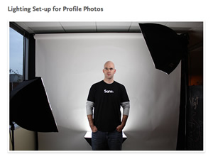
The thing I like most is the bit about the lighting set up for their avatar shots. I've been on lots of sites where the employee head shots look different because they've used a different photographer or lighting angle, so it's nice to see one documented.
It also contains photos of their sketches, wireframes and mind maps, it's always interesting to see how other people work and the ideas they threw away.
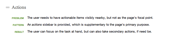
Fellowship Technology's Patterns
This example has screenshots of all the different patterns used on the site, what they do and when they're appropriate. It's cool, it's like a User Experience style guide. I hope to see more of this type of documentation being produced.
Some tools to help you make style guides
I've also been bookmarking sites that help you make a style guide. Here are a few of them:
- Styletil.es is a .psd template to help designers create something in between a mood board and a mockup
- Jeremy Keith has put his Pattern Primer template on Github.
- Style Bootstrap is a style guide that you can customise and download