Inspired by affordance on a vacuum cleaner
/34
I’ve been looking a lot at the use of colours in physical objects recently. Often you’re asked to work on a site where the brand colours are some hideous combination of yellow and blue or red and green, and you’re expected to make those colours work well together.
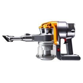
I watched a video about vacuum cleaners back when I was studying Product Design for A-Level, and the presenter was talking about the use of colour on the Dyson range. The buttons and levers, the bits that you interact with, were designed to be a contrasting colour to the rest of the machine, and that instantly makes it so much more useable because it’s obvious which bits you interact with and which you don’t.
It’s frustrating when you try and interact with products that are beautiful to look at in the showroom, but difficult to use in their native environment. Take television sets. If you’re watching a film in the dark and want to turn the volume up, or change the channel without the remote, most of the time it’s impossible to tell which button does what because the corresponding symbol is such a low contrast to the background. Give it a different colour or texture, and immediately it’s more usable.
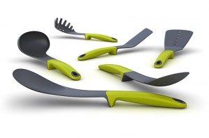
With so much choice over what products we buy (that all do pretty much the same thing), the products that do things differently really stand out. Take the Joseph utensil range. It’s a spatula. It doesn’t do anything that other spatulas can’t do, except it has a bit of plastic on the bottom that stops it touching the worksurface. And that tiny bit of plastic makes it new, more human and desirable. Also note the lime greens on the handles – the bits that you hold and interact with.
Next time you’re faced with a hideous colour scheme, ration those colours and use them as visual tools.