Comparison of the UK's political party websites
/38
Government and political party websites are some of the worst designed out there, which is a shame because they often have a lot of important information to communicate. Last year we saw how a strong online presence so positively benefited Obama’s campaign and won the inspiration of many young people, an audience the media claims to be disillusioned with politics. I wanted to see how each of the main UK party websites compared, so I’ve done a comparison of the design and code of 4 of them (plus an extra minor party for the lols).
Please note I dislike each party equally, so no bias intended.
Labour
I had some great criticisms lined up for Labour’s website, but they redesigned it halfway through writing this post. It’s a vast improvement on the previous one, although the code is a disappointment.
Design:
I think the new design is ok (compared to the others). It’s consistent, clear and easy to read. Although the drop-down navigation doesn’t work when JavaScript is disabled, the pages still link to the subpages so it degrades nicely.
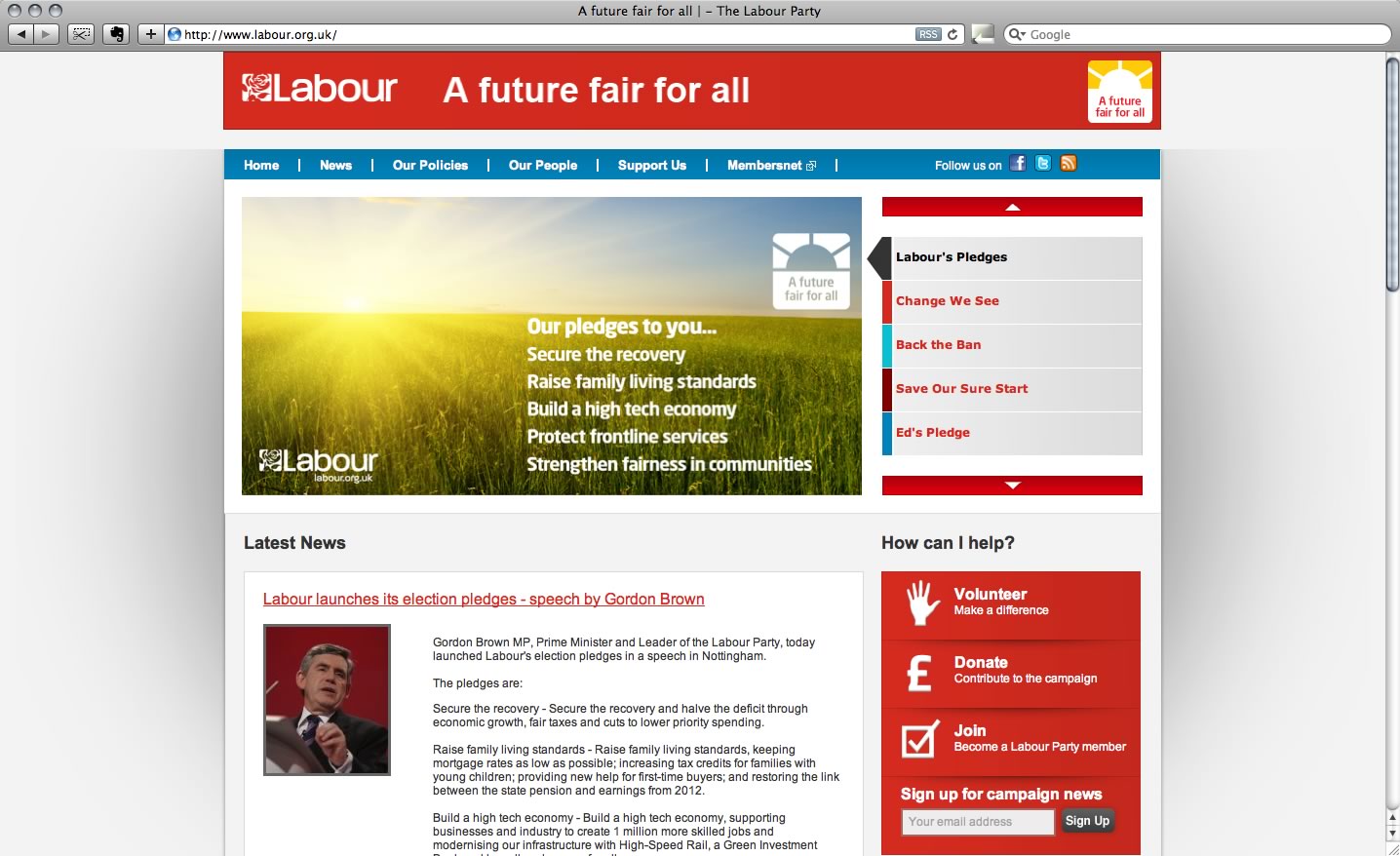
Most of the website responds well when the text size is increased, but there are a lot of elements with fixed heights, making it difficult or impossible to read. The links below from the policies section could have so easily be made to expand when the text gets bigger.
Code
The structure of the code is good, but the choice of id and class names very poor. Some of the div ids are prefixed by the word “div”. It’s completely unnecessary. There are also lots of instances of div_a, div_b, li id="a", li id="b", id="small-column-left", so not very semantic code. There are far too many ids. On any site, especially this size or being maintained by other people, it is far better to use classes over ids. Ids are for addressable content and cannot be reused more than once on the same page. Classes are much more flexible and achieve the same result.
Overall impression
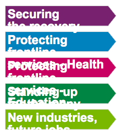
I spent half an hour on their site, and I still don’t know what they stand for. Protecting front line services? Who doesn’t have this as a policy? Also, longcat waffle like this isn’t helpful, I want bulletpoints. Although they have a lot written about general areas such as the economy and healthcare, I still don’t really know where they stand on each policy. Every party is pro education, pro healthcare and pro jobs, but it’s the little things that I want to know about. In their policies section they have a search box where you can search their policies. I think this is a really nice idea, but I want to know where Labour stand on things like abortion and euthanasia, both things I couldn’t find when I searched on their site.
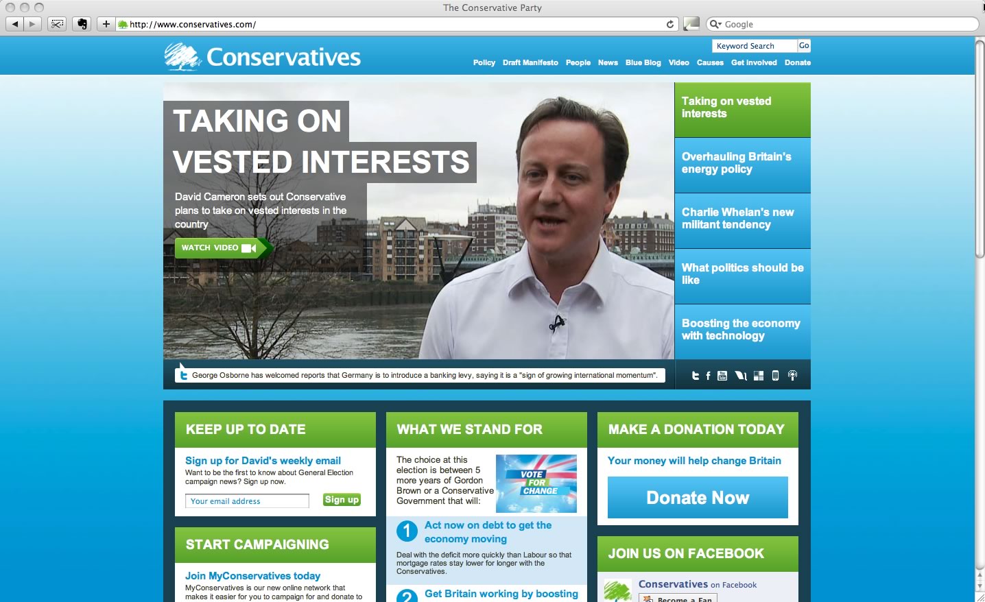
Conservatives
Design
The design isn’t bad, it doesn’t look as outdated as most. However, this is just the homepage. The inner pages look very different. (How appropriate). The secondary navigation, and even some of the design is inconsistent throughout the site, making the website that much more difficult to use.
Code
Classes are reused nicely, and the navigation has access keys. Severe case of divitus though and a lot of JavaScript.
Overall impression
I’m disappointed by what initially looked to be a semi-decent website. My main frustration was that so many of their policies and manifestos were downloadable PDFs or fancy page-flip Flash rather than HTML pages. It’s just lazy.
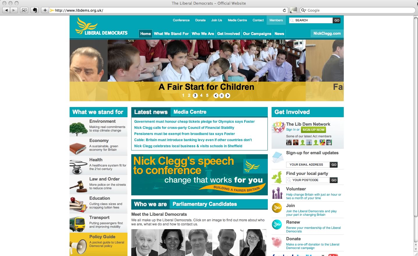
Liberal Democrats
Design
When I first visited this site, I thought this was it. Oh right, it’s a splash page. Hello 1998.
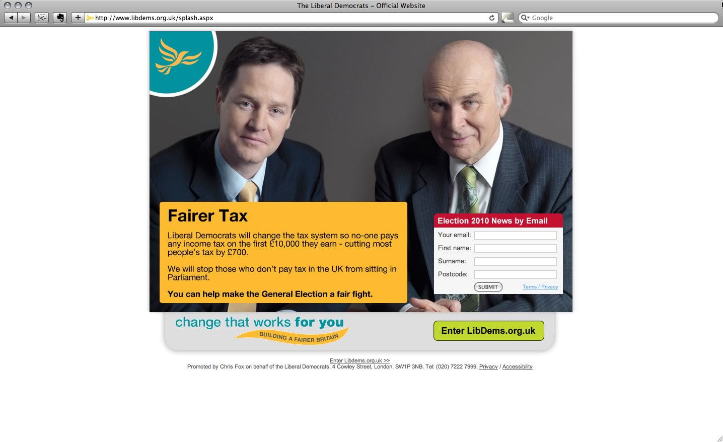
You’ve got to have a little sympathy for the Lib dems for having the ugliest colour scheme – cyan and yellow. It’s very boxy and boring, and the photos are uninspiring. Mostly old men in suits wistfully pointing at things.
There’s a lot of visual clutter and cliché stock images.
Code
Every div has an id prefixed by the word “div”. And if that isn’t enough, nested within #divTop, we’ve got #divTopLeft, #divTopCentre and #divTopRight. And within #divTopCentre we’ve got #divTopCentreTop and #divTopCentreBottom. Blimey.
Overall impression
A really average site. The “what we stand for” navigation menu is useful, but there really is too much to look at on one page.
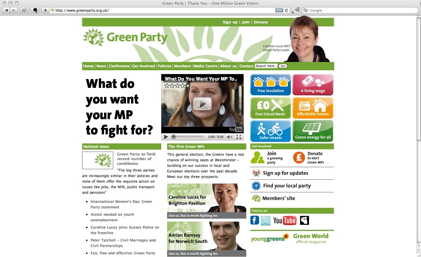
Green
Design
I’m personally not keen on the Green party’s website design. To me it feels like a hippy local newspaper site. It’s very blocky, things don’t align, and the link styles are too close to the normal text style.
Code
The code is along the same lines as the Lib dem website. Lots of unsemantic ids and classes like “left” and “right”. I don’t understand why they’ve bothered putting a “Validate XHTML” link on the site since it doesn’t actually validate.
Overall impression
I expected a little more from the Green party as they seem to be quite ahead with technology and are very popular with students. Saying that, their candidate MP Caroline Lucas’s site is really quite nice. I just wish they used that same style on the main site.
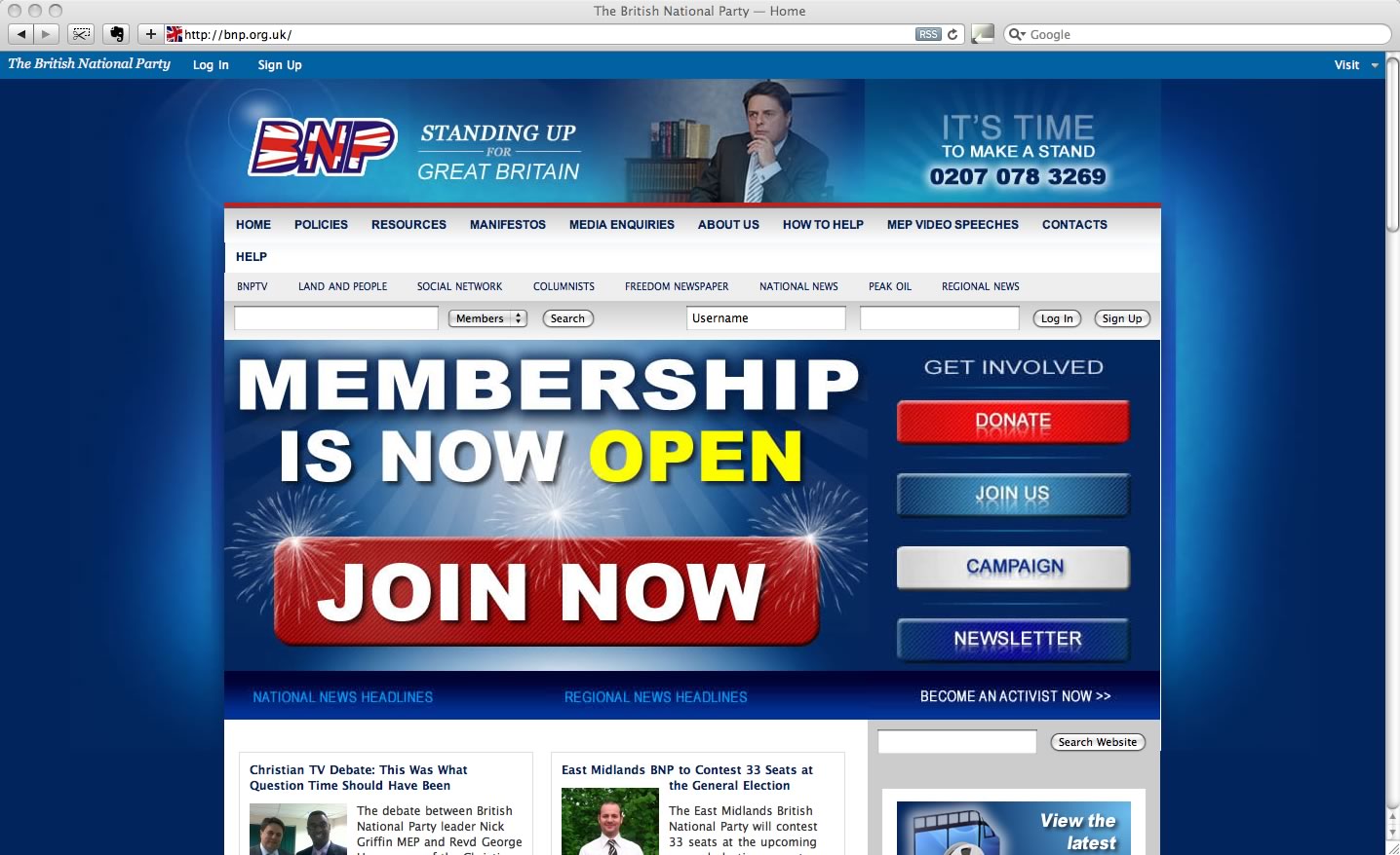
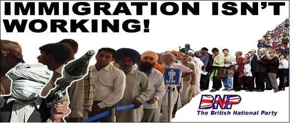
British National Party
I was going to avoid the BNP since I don’t consider them to be a proper political party, but their website is so ridiculous I thought I’d put them in here to win the wooden spoon award. If you haven’t heard of them, their policies are far-right, anti-immigration, anti foreign aid and pro capital punishment. Some public sector workforces such as the police ban membership from the party.
Design
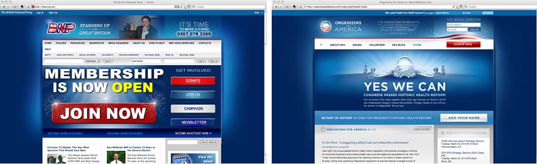
It seems ironic that the BNP’s website is so similar coughplagiarisedcough to the Obama website.

Code
The site is a hybrid of divs, more divs, break tags and tables. The only heading level is an h2.
Overall impression
The design is completely ripped off and has a bad case of photoshop vomit. The code is average and needs more heading levels to be semantic. The navigation wraps onto 2 lines, and the site generally looks like it was designed in Microsoft Publisher.
Summary
Too many of the party sites only had a vague list of their policies. A shopping list style of policies with links to more information on each one would be very useful. And it’s not just education and healthcare that people care about. They want to know the things like whether their party is pro euthanasia, pro abortion or pro same sex marriage, but too many parties shy away from doing this in case it turns voters off. Vague lists are meaningless and only serve to confuse potential voters.
Considering the success of Obama’s political campaign which had such a strong online emphasis, I expected the UK politcal parties to respond by improving their online experiences, but they’re disappointingly behind. They may not have as big budgets, but it’s a very effective form of marketing when it’s done right.