nth-of-type and media queries
/68
At the moment I'm refreshing an old site and adapting some code I wrote 3 years ago. A few of the pages have lists of teasers to full articles which are displayed in a grid. They use nth-of-type to remove margins off every 3rd block on a row, and clear the block after that.
Back then, I did a write-up of this technique. It's a little ropey and basic, but I've adapted the code since.
A while ago I bought a big screen to plug into my laptop, and it's been a real eye-opener. It makes some sites look like when you're using a tablet and a mobile version of the site is being displayed. So I've been updating my nth-of-type code, using it to change the number of blocks displayed in a row depending on the width of the screen.
Have a look at the demo in jsbin if you want to try it out.
This code isn't perfect and I'm still tweaking it, but I just want to document it in case someone else finds it useful.
The HTML is just an ordered list like so:
<ol class="teasers">
    <li>Lorem ipsum dolor sit amet, consectetuer adipiscing elit. Donec odio. Quisque volutpat mattis eros. Nullam malesuada erat ut turpis. Suspendisse urna nibh, viverra non, semper suscipit, posuere a, pede.</li>
    <li>Donec nec justo eget felis facilisis fermentum. Aliquam porttitor mauris sit amet orci. Aenean dignissim pellentesque felis.</li>
    …
</ol>
I've given the list a class of "teasers" to distinguish it from any other ordered lists on the site. At the moment, I'm just going to build a linearised version with the blocks spanning the full width of the screen. This means sites that don't understand media queries will always just display the linearised version. I'll give them a bit of colour too so I can see what's happening.
.teasers {
    margin:0;
    padding:0;
    }

.teasers li {
    background-color: #333;
    color: #eee;
    float: left;
    clear: none;
    margin-right: 2%;
    margin-bottom: 1em;
    border-radius: 0.2em;
    padding: 1em 2%;
    width:96%
    }
Now I'm going to start adding some media queries, first for a width of more than 400px. (I'm using px for demonstration but you may want to consider using ems instead).
@media (min-width:400px) {
.teasers li {
width: 45%;
}
.teasers li:nth-of-type(2n+2) {
margin-right: 0;
}
.teasers li:nth-of-type(2n+3) {
clear: both;
}
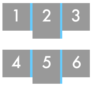
}I've given all the list items a width of 45% which sits them in a 2 column grid, and on the second block of every row, I've removed the margin-right using nth-of-type(2n+2) so it's flush with the right hand edge. I've also forced the block that comes after that to go onto the next line using nth-of-type(2n+3). This only adds up to 90%, but I already gave a padding of 2% to each side, and the first block on each column has a margin-right of 2%, which adds up to 100%.
That looks good, but now I want to make a 3 column grid if the width gets bigger than 800px.
@media (min-width:800px) {

.teasers li,
.teasers li:nth-of-type(2n+2),
.teasers li:nth-of-type(2n+3) {
    width: 28%;
    float: left;
    clear: none;
    margin-right: 2%;
    }

.teasers li:nth-of-type(3n+3) {
    margin-right: 0;
    }

.teasers li:nth-of-type(3n+4) {
    clear: both;
    }

}
Now all blocks have a width of 28%. I've also specified nth-of-type(2n+2) and nth-of-type(2n+3) to override the styles I gave them in the previous media query block. Pretty much the same deal going on here except now I'm targeting every 3rd block to remove the margin-right, and every block after the 3rd block to force it to clear.
@media (min-width:1200px) {

.teasers li,
.teasers li:nth-of-type(2n+2),
.teasers li:nth-of-type(2n+3),
.teasers li:nth-of-type(3n+3),
.teasers li:nth-of-type(3n+4) {
    width: 22%;
    float: left;
    clear: none;
    margin-right: 1.29%;
    padding: 1em 1%
    }

.teasers li:nth-of-type(4n+4) {
    margin-right: 0;
    }

.teasers li:nth-of-type(4n+5) {
    clear: both;
    }

}
It goes on like this, but I've tweaked the margin-right and the padding to a lower number because it was looking a bit gappy. It doesn't add up exactly to 100% because browsers sometimes rounds numbers weirdly and that causes the grid to break, so I try and keep it just under.
Of course, the usual disclaimers about browser compatibility and the fact that this code is still my work in progress, but I can see this working great on a site that has product listings.